
Excerpt from " ADOBE PHOTOSHOP ELEMENTS for TEXTILE DESIGN
" by Frederick L Chipkin ISBN:# 978-0-9727317-3-7
A step by step tutorial on how to use GIMP to create Textile Designs
To order " ADOBE PHOTOSHOP
ELEMENTS for TEXTILE DESIGN " click the leaf
We've provided this sample to give you a feel for some of the basic techniques taught in our book "ADOBE PHOTOSHOP ELEMENTS for TEXTILE DESIGN". To see a list of more advanced textile design techniques covered click on the leaves above. Please note that even the more advanced textile design techniques in the book are taught in this clear and easy to follow manner. Included with the book is a CD with practice textile images and color charts. With these tools in hand you should be up and running in a very short time.
The Marquee trick
This technique takes judgment and trial and error to get it right. It’s another way to color reduce your design down to indexed color. It’s not as accurate as the previous technique however when it works it can save you a lot of time and hassle.
In a perfect world you wouldn’t need any complicated steps to color reduce a design down to indexed color. You would simply go to Image→ Mode→ Indexed Color→ Local (Adaptive) and Voilà! Your design would be perfectly color reduced. But sadly this usually never works. The reason for this is that Elements will take an average of all the colors and reduced your design down to the most common colors found in it.
For example: Let’s say you were working on a design that consisted of small tonal flowers that were space on a solid blue ground. Then went to Image→ Mode→ Indexed Color→ Local (Adaptive) → OK. What you would end up with is way too many blues and not enough flower colors.
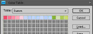
Try this out for yourself. Open up the design DITSY from the folder called PRACTICE IMAGES on the CD. While color reducing the design down to indexed color make sure that the Palette is set to Local (Adaptive) and choose 16 for the Colors. After the design has been color reduced you will have an image that has your flower and leaf colors plus quite a few shades of blue. To see these colors for yourself (all the colors that are actually in your design) go to IMAGE→ MODE→ COLOR TABLE. The COLOR TABLE will pop up. In the COLOR TABLE you should see way too many blues for this design.
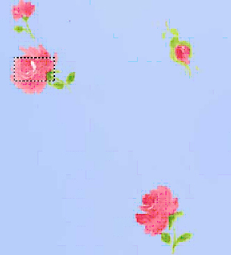
Now close the file DITSY (do not save it) and then open it again. Try the same thing again, but this time first place a Marquee (using the Rectangular Marquee tool) over one of the flower motifs along with a little bit of the blue ground color, and then reduce it down to indexed color (Image→ Mode→ Indexed Color→ Local (Adaptive) and choose 16 for the Colors. → OK).
The
Marquee Trick
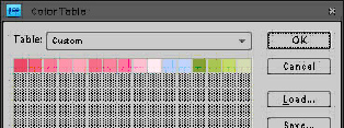
If you do this then Elements will reduce your design down to the most common colors found in the Marquee box. To see these colors for yourself (all the colors that are actually in your design) go to IMAGE→ MODE→ COLOR TABLE. The COLOR TABLE will pop up. In the COLOR TABLE you should see less blues then before. It should look something like the illustration below. Try it. You’ll like it!
6. Cleaning your design
The process of cleaning a design is the process of neatening it up. It’s totally subjective so there is no right or wrong way to do it. Sometimes you clean your design before you color reduce it. Sometimes you clean it after.
While working on your design (before or after you color reduce it) there are several hurdles you’ll have to deal with. One thing you’ll notice is that there are stray pixels (dusty looking speckles) in parts of the design where you don’t want them to be. Another thing you may notice is that some of the shapes in the design do not look the way that you want them to look.
Use your drawing, selection and fill tools to clean up these stray pixels and neaten up (by redrawing) the parts of your design that you don’t like. This is a very simple task that you will be doing, however it requires judgment and you will only acquire judgment through practice.
This may seem too simple for you and you may want a trick.
OK, here’s the trick.
“The Trick”
This trick is usually used when you have a design that has a flat ground and has been color reduced down to indexed color. Within this flat ground you have a lot of stray pixels (dust) that you don’t want to be there.
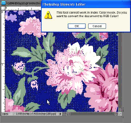
1. Start by opening the design called CLEANING from the PRACTICE IMAGES folder on the CD.
2. Make sure that your background color on the Toolbox is set to the dark blue background color in your design.
3. Now simply take your magic wand and select (click) on the background color of the design. As soon as you click on the design a dialog box will pop up asking you if you want to convert the design to RGB color. Click on OK.
4. Go to Select→